Import climate-change.csv file
Please find the data file href = “https://github.com/ZeningQu/World-Bank-Data-by-Indicators”
Data explanation: Climate change in US
Due to the importance of This data set includes climate change information for countries throughout the world from 1960-2016. Climate change data provides information about green house gas(GHG) emissions, land areas, population, and renewable energy.In this project, I am going to explore climate change indicators in the US from 1960-2016. In some indicators, we may have information for shorter time horizon. In the following, the project questions are provided based on the four main subject area of (1)GHG emissions, (2) Population, (3) Renewable energy, and (4) Land analysis.
Questions
Investigation of GHG emissions:
- What is the trend of annual emitting Co2 from gaseous fuel consumption, liquid fuel consumption, and solid liquid fuel consumption in the US?
- What is the trend of annual emitting Nitrous oxide in the US?
- What is the trend of annual emitting Methane in the US?
Population:
- Has population growth an impact on GHG emission?
- Has total population trend an impact on GHG emission?
Renewable energy:
- What is the trend of renewable energy consumption?
Land analysis:
- What is the effect of arable land on climate change?
- What is the effect of agricultural land percent on climate change?
Regression:
- What are the prediction of total population of the US in 2025 and the renewable energy consumption percent of total final energy consumption?
GHG emissions
CO2 emissions
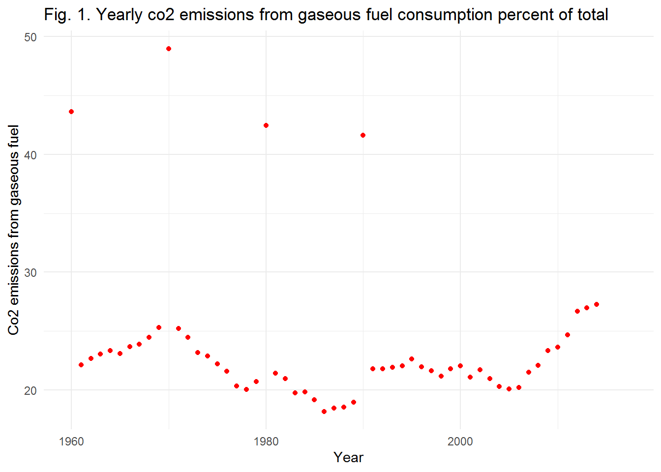 Fig. 1 shows yearly co2 emissions from gaseous fuel consumption percent of total. As shown, we have four outlier data, 1960, 1970, 1980, and 1990. Moreover, there is not a steady increasing or decreasing trend in data. Nevertheless, last two decades are more important for us as climate change issues has attracted more attention in recent years. The increasing amount of emitting Co2 from gaseous fuel consumption in recent years is obvious. We suggest using more bio-gas to save the environment.
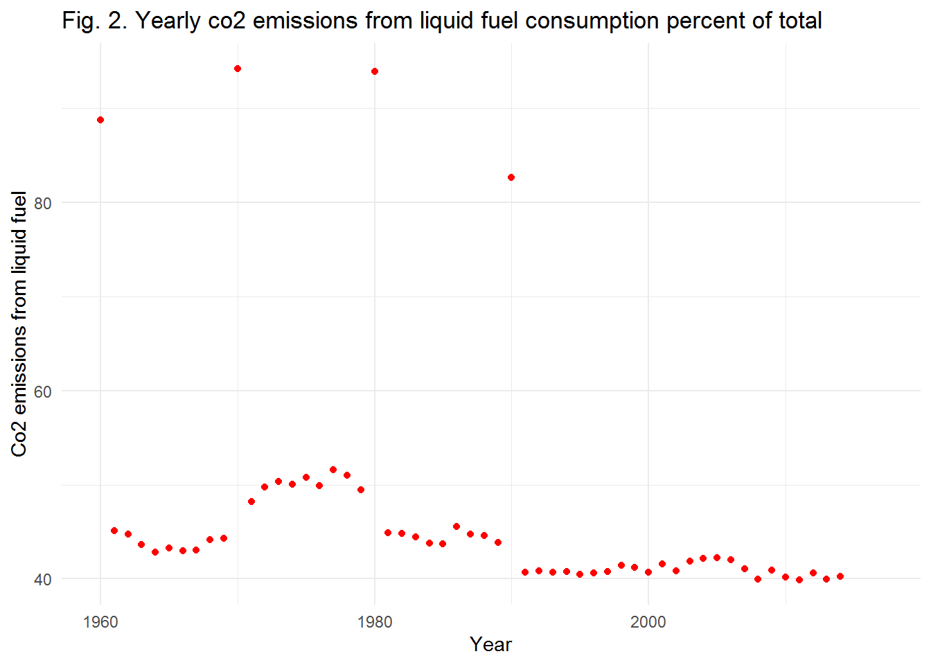 In Fig. 2, yearly co2 emissions from liquid fuel consumption percent of total is plotted. Like the previous Figure, we have four outlier data, 1960, 1970, 1980, and 1990. In total, we can see a decreasing rate of Co2 emission from liquid fuel consumption between 1960-2014. In recent years, there is no significant change in the amount of Co2 emitted. However, the Co2 emission from liquid fuel is almost 40% of total amount which is 15%-20% in average more than gaseous fuel emission.
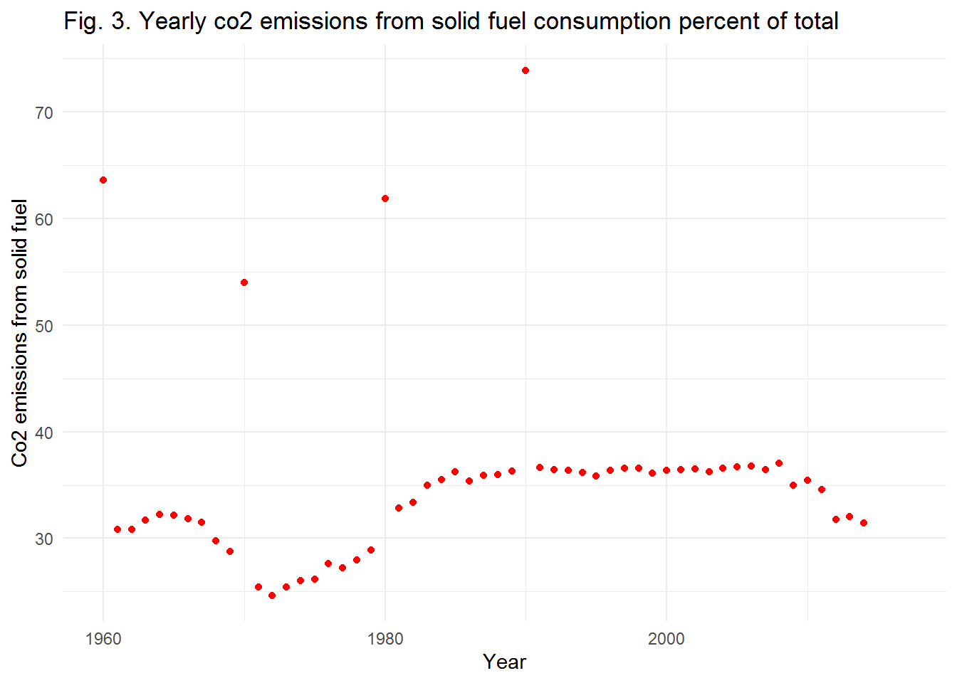 In Fig. 3, yearly co2 emissions from solid fuel consumption percent of total is plotted. There are four outlier data in years 1960, 1970, 1980, and 1990. Besides, Co2 emissions in years between 1980-2014 are more than 1960-1980. In last five years of study, we can see a significant decrease, almost 5 percent, in the Co2 emission. It shows that solid fuel consumption is diminishing. We know that reducing the Co2 emission which is the most important GHG emission is so good for climate change concens.
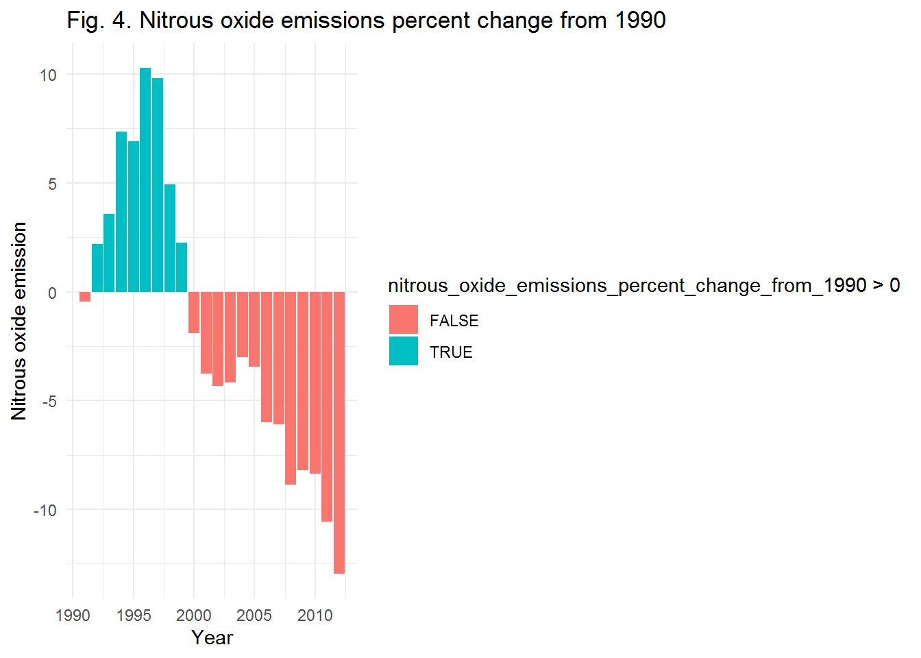 Fig. 4 indicates the Nitrous oxide emissions percent change from 1990-2012. There is a decreasing trend in the last two decades. Nitrous oxide could be emitted because of pesticide use in agriculture sector. Significant decrease in the emitted amount of Nitrous has positive effect on climate change indicators.
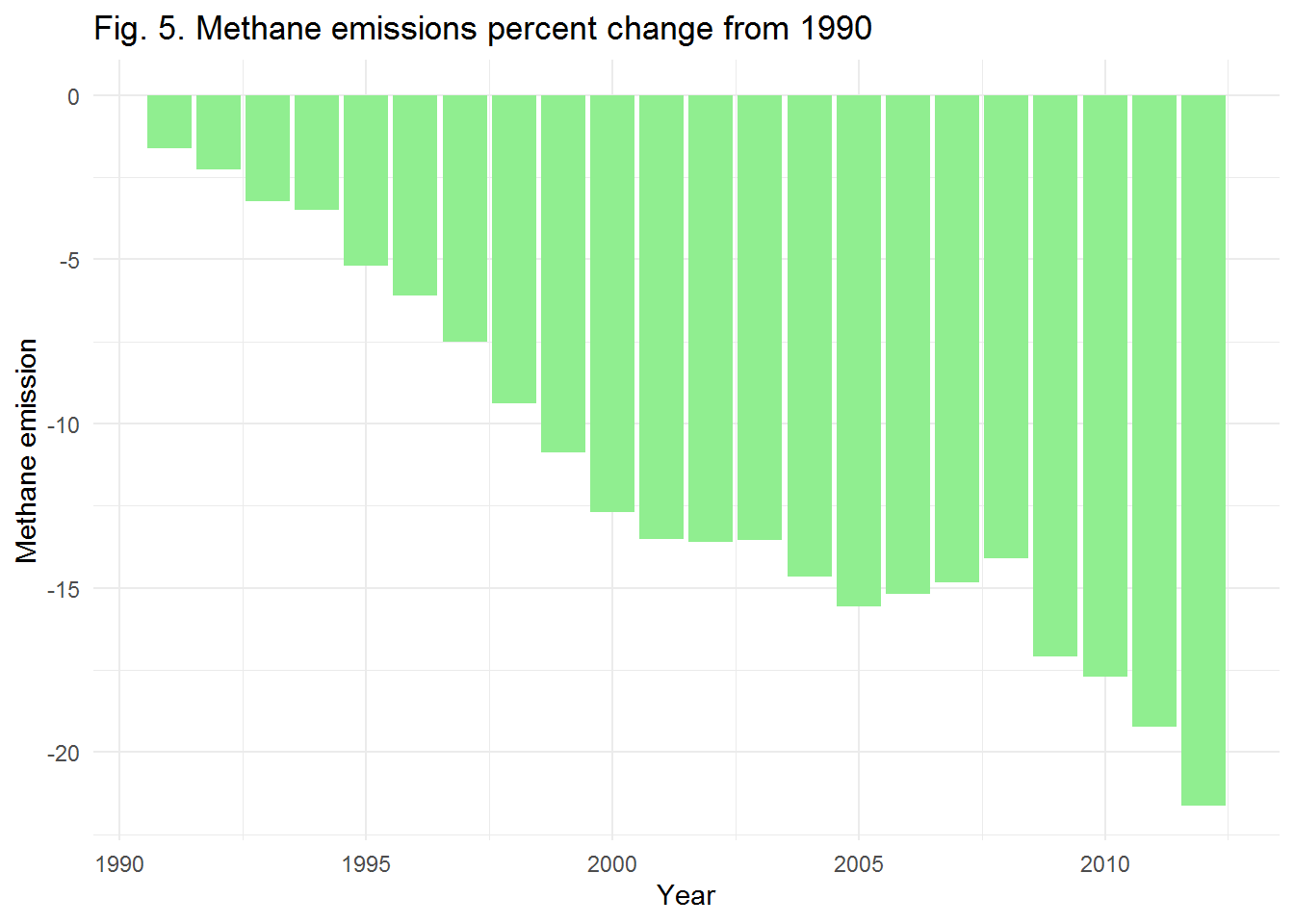 Methane is another result of using pesticides in agri-business industry. Fig. 5 shows methane emissions percent change from 1990-2012. Fortunately, there is a diminishing trend in methane emission. We can see almost 20 percent decrease in methane emission. Although Methane is one of the GHG emissions, it’s decreasing trend is so good for climate change concerns. According to the climate change indicators analysis, average rate of GHG emission is decreasing especially from 2000, but which factor is the reason of that? Population growth rate or renewable energy consumption? Lets go to the next steps of analysis to find the solution.
Population
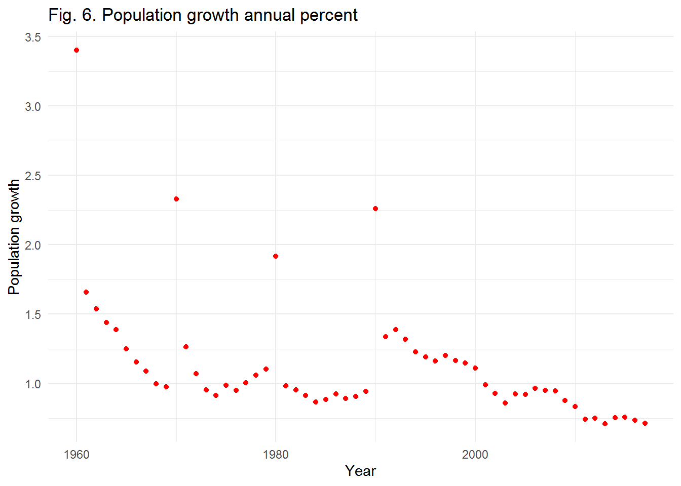 First, there are four outlier data in years 1960, 1970, 1980, and 1990. Fig. 6 indicates the annual percent of population growth between 1960-2016. It’s a sharp increase in population growth in 1990 but we do not know the reseaon. In total, there is a decreasing population growth rate from 1990 in the US. May be it’s the reason of decreasing some GHG emissions but we should take a look at the annual population.
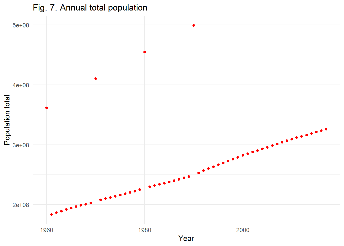 There are also four outlier data in years 1960, 1970, 1980, and 1990. Fig. 7 shows the annual total population in the Us. Although there is a diminishing trend in population growth of the US, total population is increasing from 1960. Therefore, the population would not be the main reason of decreasing some GHG emissions. In the next phase of data analysis, we are going to explore the renewable energy consumption in the US.
Renewable energy
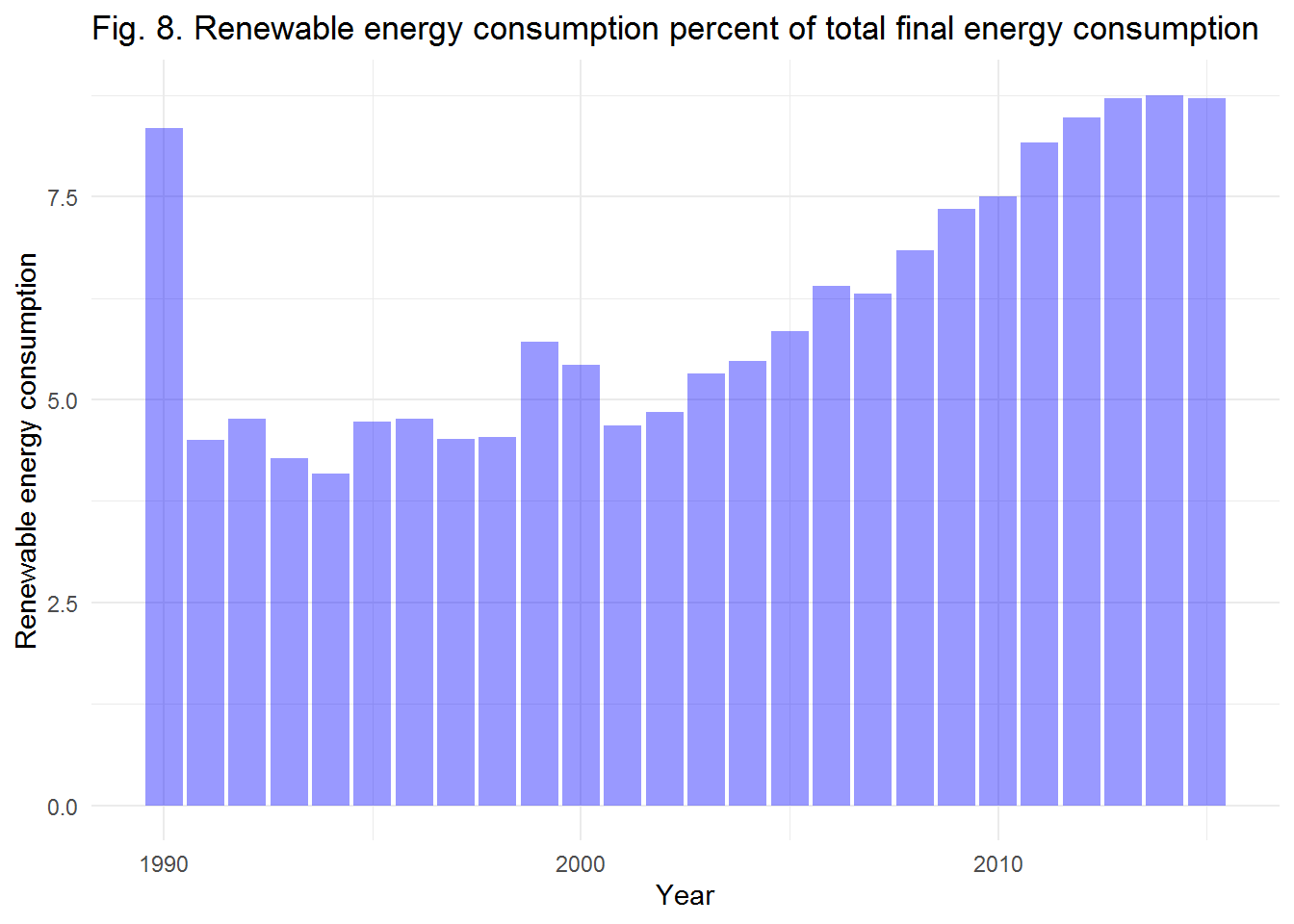 Fig. 8 shows the share of annually renewable energy consumption from total energy consumption in the US. As shown, there is a sharp increase in renewable consumption from 2000-2015, almost 3.5 percent. Therefore, this increase could be the reason of decreasing some GHG emissions. However, the maximum percent of renewable consumption is 7.5 percent which is very low compared to the other energy sources that can impose hazardous impacts on the environment. Our most concern is Co2 emissions from gaseous fuel consumption that we suggest to use more biogas sources.
Land analysis
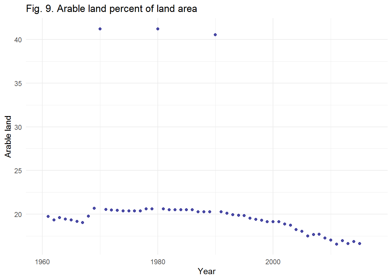 There are also four outlier data in years 1960, 1970, 1980, and 1990 which shows the weakness of the data set in some varables. According to Fig. 9, the annual arable land percet of land area in the US has decreased specially from 2000 to 2015. This shows the effect of climate change in the arable land area which provides the agriculture land area. This means that by increasing population in the US, the arable land area is decreasing and accordingly it may result in decreasing food production. Therefore, we need to analyze the agriculture land percent in this study.
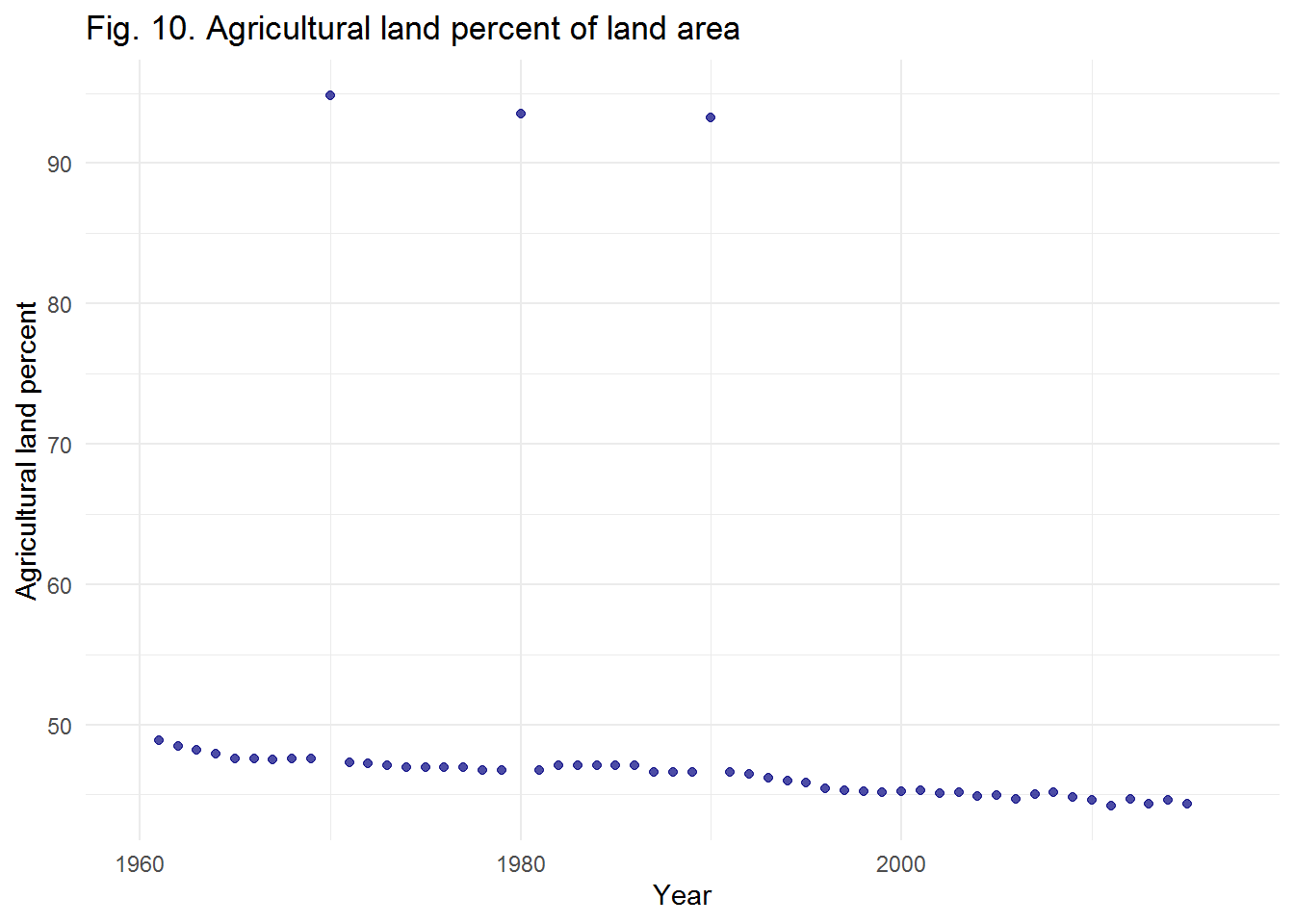 There are four outlier data in years 1960, 1970, 1980, and 1990. As indicated in Fig. 10, we can see a decreasing trend in agricultural land percent of land area, almost 5 percent decrease. Nevertheless, in recent years, especially from 2000, the agricultural land percent has steady trend and it resolves our concerns about the lack of food production because of decreasing arable land percent of land area from 2000(please see Fig. 9). However, it may affect the agricultural land percent in the following years that we have no it’s data. We can use linear regression model to predict the trend of agricultural land percent.
What are the prediction of total population of the US in 2025 and the renewable energy consumption percent of total final energy consumption?
To answer this question, we plot two linear regression model to find the prediction of annual total population of the US and the renewable energy consumption percent of total final energy consumption in the US?
\[\widehat{population_total}_{i} = \beta_0 + \beta_1 \times year_{i}\]
## `geom_smooth()` using formula 'y ~ x'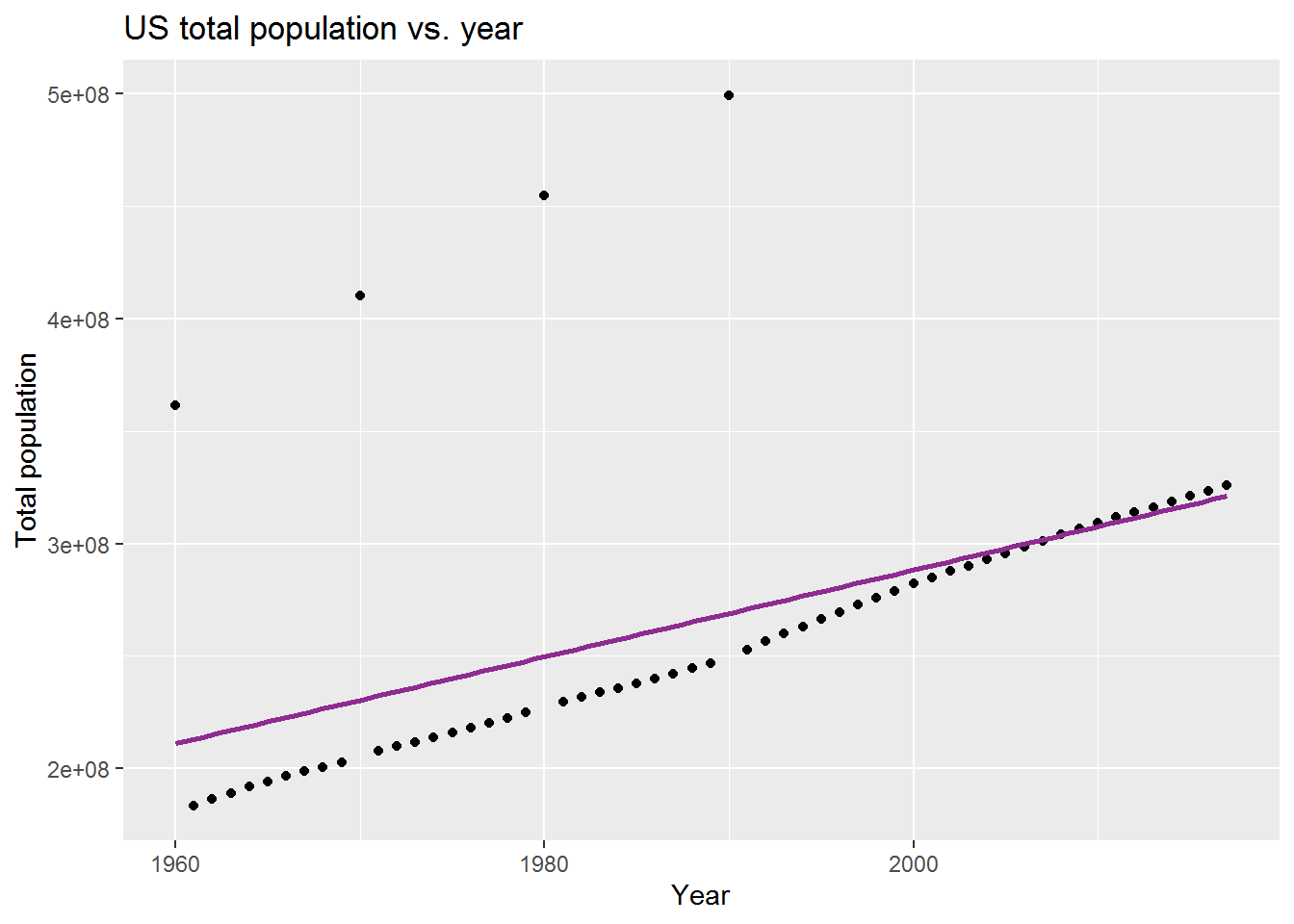
## # A tibble: 2 x 5
##   term            estimate  std.error statistic   p.value
##   <chr>              <dbl>      <dbl>     <dbl>     <dbl>
## 1 (Intercept) -3567770388. 852501925.     -4.19 0.000102
## 2 year            1928045.    428701.      4.50 0.0000351
The US total population & year
As the p.value is less than 0.05, we conclude that this linear regression is perfectly fitted to our data set. In the following, you can see the relationship between the US total population and year.
\[\widehat{totalpopulation_{in}} = -3567770388 + 1928045~year\] What is the US total population in 2025?
\[\widehat{totalpopulation_{in}} = -3567770388 + 1928045 * 2025 = 336520737\]
\[\widehat{Renewableenergyconsumption}_{i} = \beta_0 + \beta_1 \times year_{i}\]
## `geom_smooth()` using formula 'y ~ x'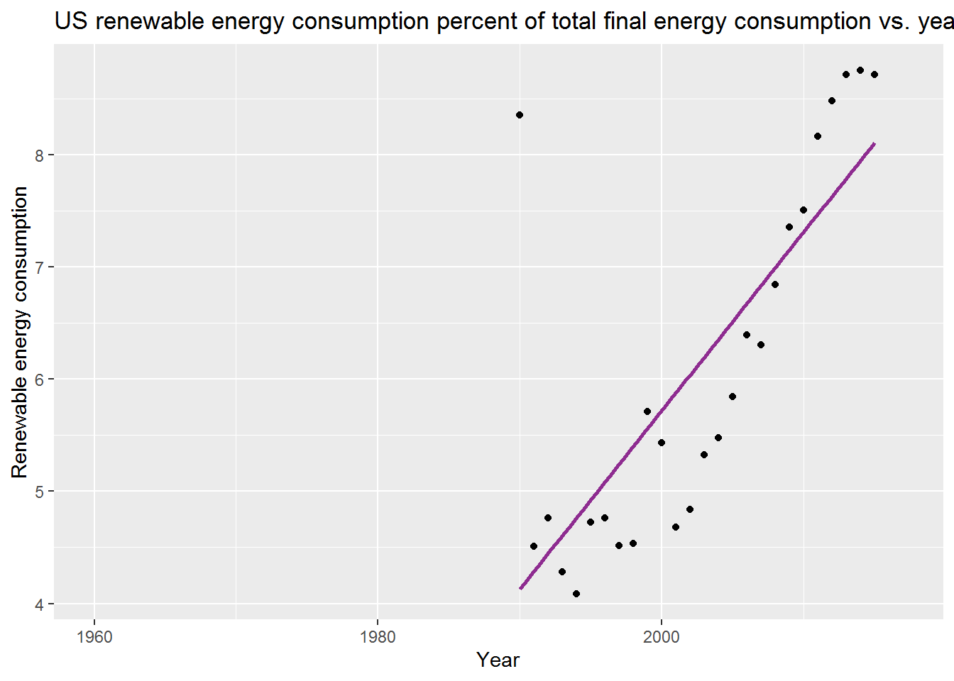
## # A tibble: 2 x 5
##   term        estimate std.error statistic    p.value
##   <chr>          <dbl>     <dbl>     <dbl>      <dbl>
## 1 (Intercept) -313.      57.0        -5.48 0.0000124
## 2 year           0.159    0.0285      5.59 0.00000946
Renewable energy consumption percent of total energy consumption & year
As the p.value is less than 0.05, we conclude that this linear regression is perfectly fitted to our data set. In the following, you can see the relationship between the US renewable energy consumption percent of total energy consumption and year. \[\widehat{Renewableenergyconsumption_{in}} = -312.5935454 + 0.1591569~year\] What is the US renewable energy consumption percent of total energy consumption in 2025?
\[\widehat{Renewableenergyconsumption_{in}} = -312.5935454 + 0.1591569 * 2025 = 9.6991771 \]
Therefore, in 2025, the US total population is predicted to be 336520737 with almost 9.7 renewable energy consumption percent of total energy consumption. Compared to the 2015, the prediction shows only 1 percent increase in renewable energy consumption by increasing 19280450 people in the US. Due to importance of sustainable development and climate change concerns in recent years, we suggest to use more renewable energy sources to save the environment and human health.
Summary
The climate change data set provides some environmental, poulation, renewable energy consumption, and population indicators between 1960-2016. In this project, the US climate change indicators for available years have been analyzed. In some indicators, there are outlier data for some years including 1960, 1970, 1980, and 1990. Generally, the GHG emission is decreasing in recent years and the renewable energy consumption is increasing. However, we suggest more renewable energy consumption as the US total population is decreasing. Accordingly, we could move toward sustainability development and reduce climate change concerns.